What is an Organizational Chart and Why is it Important?
An organizational chart, also known as an ‘org chart’, is a highly flexible and valuable tool that businesses can use to display their structures. Built in the form of a flow diagram, the org chart illustrates relationships between different people and departments within a business, often from ‘bottom’ to ‘top’.
Whether it’s to communicate your structure to new employees, map out a proposal for a restructure, plan a project, or simply to map out reporting relationships, there are many reasons why an organization may need to do this.
What Does an Organizational Chart Show?
You’ve probably seen an org chart before. They feature boxes, shapes, or photographs that represent people and positions within a company. These boxes can also include contact information, physical locations (i.e., country, office), working hours, departments, page links, icons, illustrations, and more.
These boxes are connected with lines to form a chart that illustrates an organization’s internal structure. These lines show who reports to whom, how departments are connected, where divisions are, and who’s responsible for what.
The purpose of an org chart depends entirely on its use case, some of which we highlighted above. Generally speaking, however, their overarching purpose is to enable people to put names to faces, roles, and responsibilities, which:
- Helps employees find out who to report to or contact for specific things,
- Makes it easy to keep employee contact information in a single, centralized place,
- Provides a top-down view of departments to aid resource management,
- Gives staff an insight into progression potential and opportunities, and
- Clarifies the roles and responsibilities of individuals within a company.
There are many types of org charts to choose from. Here’s a quick look at some of the most popular and widely used ones, and what they show.
Traditional ‘Hierarchical’ Org Charts
The “traditional” hierarchical org chart is by far the most common type that you’ll come across. Often referred to simply as a ‘hierarchy’ or a ‘pyramid-shaped’ chart, it depicts the chain of command from the top (e.g., the CEO or a manager) downwards (e.g., entry-level roles) and each employee sans CEO on the chart has their own supervisor.
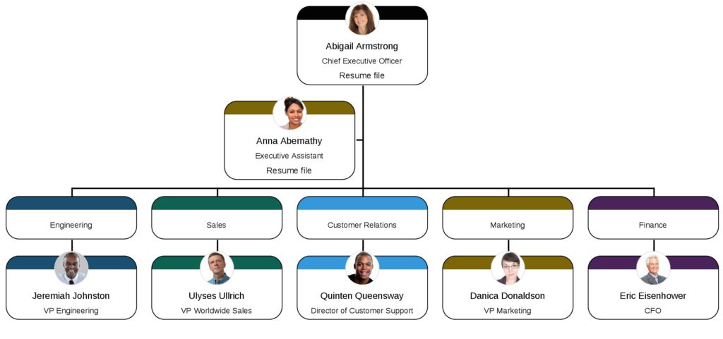
The hierarchical org chart shows where the “power” lies in an organization. Those at the top wield the most while those closer to the bottom have very limited authority or none at all. In a hierarchy, members typically communicate upwards to their immediate superior.
‘Flat’ or ‘Horizontal’ Org Charts
These are sometimes referred to as ‘horizontal’ org charts. They are used in organizations where the structure features few or no levels of management between management-level and staff-level employees. This means that in the organization, there’s far less supervision and employees closer to the ‘bottom’ of the chart are more involved in the decision-making process.
A flat org chart will typically consist of only two levels: the top directors/managers and regular workers.
‘Matrix’ Org Charts
In a matrix org chart, the relationships on it are visualized as a grid as opposed to a hierarchy. It’s typically reserved for situations where individuals have more than one manager, for example during a project for the launch of a new product where the marketing team may report to both the Sales & Marketing Manager and the Project Manager simultaneously.
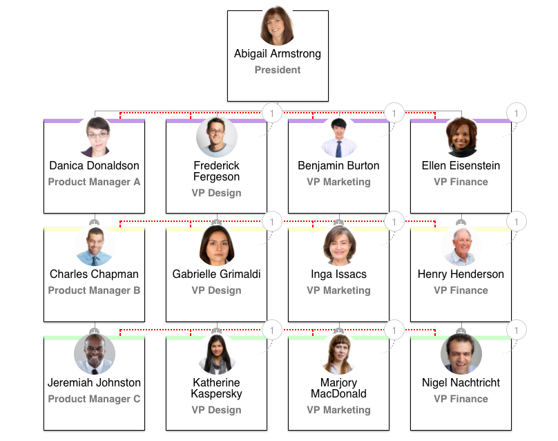
Matrix org charts are better for visualizing individual skillsets as people are often paired together for work assignments based on these and their areas of expertise.
What Doesn’t an Organizational Chart Show?
While org charts are extremely valuable when used to their full potential, there’s no denying that there are some drawbacks in terms of their limitations.
By far the biggest limitation is that org charts are only capable of showing the literal relationships between different individuals and positions. They’re not able to illustrate the finer elements of these relationships such as degrees of authority and responsibility.
Another issue with org charts is that they don’t show informal relationships; they provide zero insight into the vital informal and social relationships that have developed, and this can hinder communication. The formal nature of org charts, particularly hierarchical org charts, can give rise to feelings of inferiority, potentially alienating new hires.
What Makes a Great Org Chart?
To unlock the full potential of an org chart, it’s important that you use it right. Here are five elements that make a great org chart:
1. Simple and Clear
An org structure should be simple, utilizing the most rudimentary framework possible to fulfill its intended purpose. This will help the company accomplish its objectives in the most economical way, streamline communications, and avoid the problems that come with convoluted and complex structures with intricate reporting relationships.
A simple org structure, illustrated by a simple org chart, will make clear to every person in the organization who they report to for what. By eliminating unnecessary levels and communication channels, a simple org chart displays clear, unambiguous lines of authority.
2. Reliable and Available
Historically, org charts have come with two big pain points: i) they had a tendency to be outdated, and ii) they were difficult to access. This is because they were made either by putting pen to paper or by using tools that weren’t fit for purpose (i.e., Microsoft Word). These ‘systems’ were wholly reliant on physical, time-consuming manual updates, usually by HR staff, inevitably leading them to be neglected and forgotten about.
With modern org chart tools and software, this is no longer the case. Today, building an org chart is as simple as inputting or importing all of your data once and letting the software do all the work. As if by magic, org chart tools like Organimi keep your org charts up-to-date in real-time by integrating with other tools like Office 365, G-Suite, and Azure Active Directory.
What’s more, modern org chart tools enable 24/7 access and easy sharing so that employees can access them from anywhere and at any time.
3. Relevant
Modern org charts show far more than an employee’s name and their picture, and the best org chart tools provide complete control and flexibility to allow the definition of custom placeholders and fields.
While the utility of this cannot be understated, it’s important to be mindful of your org chart’s purpose and intent when filling it out with information, ensuring that anything included is relevant.
For instance, an org chart made for onboarding new starters should include important details like contact information, core working hours, and role titles rather than hobbies, favorite food, and interests (we’re not saying that including the latter information on an org chart is never appropriate, however!)
4. Inclusive
Org charts are designed to be collaborative and shared, not confidential and locked away, and It’s important to make them inclusive right from the very beginning.
You can achieve this by charting the entire organization from top-to-bottom so that it includes everyone from directors and managers to remote/freelance staff, interns, temps, part-timers, and even janitors. Everybody involved in the day-to-day success of your company’s mission should be included. By doing this, you’re paving the way for more communication and collaboration across the entire team.
Ready to Make Your Own?
Despite how complex they may seem, org charts are in fact very simple tools at heart that, when used correctly, can bring many benefits for businesses.
They’ve undergone a total transformation throughout the last couple of decades or so and are now easier to utilize than ever; there’s no reason why any modern organization should be operating without one.
If you’d like to learn more, try out Organimi for free today and begin charting your own success!