
Organizational charts help to illustrate the structure, hierarchy, and various reporting relationships that exist within a company. A relatively simple concept, org charts act as a vital tool in illustrating the relationships and relative ranks of various people, positions, roles, and teams within an organization.
What are Organizational Charts Used For?
The primary function of any org chart is to provide clarity on structure. By enabling a clear view of the internal makeup of an organization, org charts how different departments, units, or positions are interconnected. This clarity is particularly helpful for employees, enabling them to understand their role within the larger context of the organization.
Beyond its role in clarifying structure and reporting relationships, the org chart also facilitates communication and planning. Understanding the layout of teams and departments can significantly improve the flow of communication and the effectiveness of operational planning.
Furthermore, an org chart can be a valuable tool for enhancing resource allocation. By offering a bird’s-eye view of the organization, it aids in the efficient allocation and management of human resources, ensuring that personnel are utilized effectively. This can be particularly useful in larger organizations, where understanding the distribution of resources can be more complex.
How to Build an Organizational Chart in Microsoft Excel
Creating an organizational chart historically involved hours of manual work before the advent of digital tools like Microsoft Excel and Organimi.
Using pen and paper, human resources teams would painstakingly draw out and manually arrange shapes and lines on pieces of paper. The problem here was that these manually illustrated charts very quickly became outdated, making them unreliable and of limited utility.
With software such as PowerPoint, Google Docs, Organimi, and Excel, however, you can create an org chart in a fraction of the time it would take to build one manually.
Here’s how…
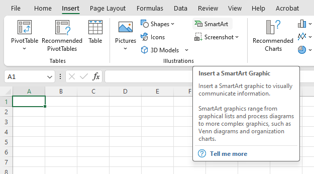
1. Use the top ribbon to navigate to Insert and select SmartArt.
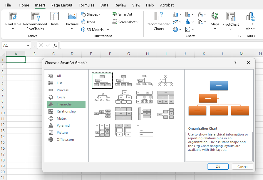
2. In the SmartArt drop-down menu, hover over Hierarchy and choose the org chart layout that you would like to generate.
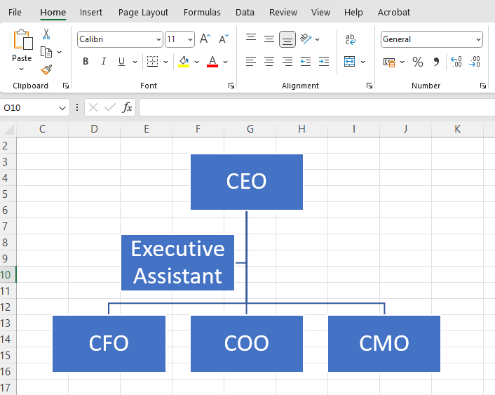
3. Once your chart has been generated, you can edit text directly in each of the boxes or by using the SmartArt text box.
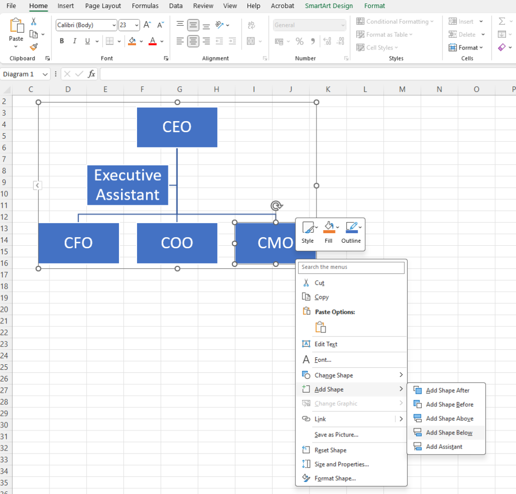
4. Add additional shapes to your chart by right-clicking and choosing where to add a shape, or by clicking the plus symbol in the SmartArt text box.
5. Once you’ve got the bones of your chart laid out, you can choose from a wide variety of colors, shapes, fonts, and other options to customize your org chart in Excel.
3 Excel Limitations and How to Solve Them
Excel is great if you want to build static organizational charts that provide basic information such as names, titles, and faces. That’s about as much as you can do, though.
Most organizations want their org chart to do more, and that’s what modern org chart software has been designed for. If you’re looking for an alternative to Excel for building an org chart or are curious about how a tool like Organimi does things better, here are three problems we solve!
Problem 1: Building Org Charts in Excel Takes Time
When you’re using Excel to build an org chart, you’ll be manually inputting data from a variety of sources.
While it’s true that this is quicker than creating your chart by hand, it’s still quite a long-winded process and, chances are, it’ll quickly become outdated and require a manual update. In a busy org, this task often isn’t a priority.
Organimi makes it possible to build an org chart in a matter of minutes by importing your data using a variety of file formats such as Excel and CSV. If you need to make changes, our intuitive drag-and-drop builder makes this a breeze. Plus, leverage a variety of features and integrations to ensure that your chart is automatically updated as roles change.
Problem 2: Excel Isn’t Collaborative
Disparate teams need live, intuitive org charts to help them schedule meetings, projects, and make contact with key individuals at any given time. When everyone’s details are locked away in an outdated Excel that nobody knows how to access, communication and collaboration become much harder.
Organimi includes features like Photoboard, Directory, and Custom Fields that enable you to create truly custom org charts that fit a myriad of functions and benefit your workforce in a variety of ways:
- Style your chart with photos, headings, highlights, and buttons.
- Easily change colors, sizes, connectors, shapes, and more.
- Export into a variety of file formats such as PDF and PPTX for presentations.
- List everything from time zone, core hours, and contact preferences using Custom Fields.
Problem 3: Excel Has Limited Functionality
An Excel-based org chart can only really be used to show formal reporting relationships between people and teams. That’s it. There’s absolutely no room for nuance or context.
Organimi’s wide range of features, however, makes it easy to not only show direct reporting relationships but also information about cross-functional teams, projects, campaigns, and more. It’s your organization’s single source of truth for quickly discovering and connecting with people both inside, outside, and between official reporting relationships.
Sign up for a free Organimi account today to get started. Need some help? Check out our variety of blog and product resources or get in touch!