
An organization’s structure serves as the backbone of its operations. It helps define roles, responsibilities, and hierarchies within the workforce. An organizational chart, or “org chart,” helps visualize these relationships clearly, providing everyone with a strong grasp of how the company is structured and their role within it
Thankfully, creating an org chart isn’t as time-consuming anymore, thanks to modern technology. Today, tools like Google Docs and Google Sheets make this process straightforward and accessible. If you’re ready to get started but not sure how, this guide is for you. We’ll teach you how to make an organizational chart in Google Docs and Google Sheets that will efficiently lay out your company’s structure.
Creating an Org Chart in Google Docs
When it comes to creating an org chart in Google Docs, you’ve got two main options: Draw it as a flowchart in Google Docs or create a Google Sheets org chart then add it to Google Docs.
Option 1: Drawing an Org Chart in Google Docs
Google Drawings is the native functionality for building flowcharts in Google Docs, which you can use as org charts. It does not require any configuration, but it is difficult to use when you need to build large, complex organizational charts.
If you’re looking for a more structured approach, consider using an org chart template in Google Docs. Follow these steps to build an org chart in Google Docs:
- Open a Google Doc.
- Select Insert > Drawing > New.
- Use the shape icon to add shapes and lines to connect them.
- When you’re finished, click “Save and Close”
You can now build a simple flowchart that will appear in your Google Docs document. This is a very rudimentary approach that you should only use for the most basic org charts.
Option 2: Using Google Sheets
Using Google Sheets is a far better option for more complicated organizational charts. Follow these steps how to create an org chart in Google Sheets:
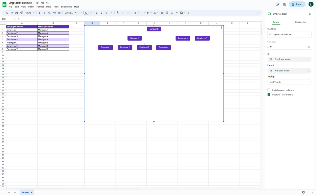
- Open a Google Sheet.
- Add “Employee Name” in Column A.
- Add “Manager Name” in Column B.
- Enter the names of employees in Column A.
- Enter the names of managers in Column B.
- Select and highlight both columns.
- Go to Insert > Chart.
- Click “Chart type.”
- Scroll to find and select “Organizational chart.”
Once you’ve created your org chart in Google Sheets, you can now add it to your Google Doc:
- Open Google Docs.
- Place your cursor where you want to add the org chart.
- Go to Insert > Chart > From Sheets.
- Select the org chart that you just created.
- Click “Import.”
Using Organimi to Build Powerful Org Charts
There’s actually a third option available to you: Use Organimi’s powerful drag-and-drop builder to create your own intuitive organizational charts in minutes.
Organimi offers endless advantages over using Google Docs to build org charts, including:
SmartChart™ Legend: Use Organimi’s unique SmartChart™ Legend feature to help visualize information on your chart and attach conditions to custom fields. Make your chart even more visually appealing with Organimi’s flexible formatting and branding options.
Drag-and-Drop Building: Organimi has been designed specifically for building org charts, meaning you can build a chart that would take hours in Google Docs in a matter of minutes using our native design features. Don’t want to build your chart manually? No problem! Import your own data and our technology will do the work for you.
Sharing and Viewing: Share your org charts privately with select individuals or companywide in one click. Give users editing or viewing rights. Don’t want all your chart information public? Choose which fields you would like to be displayed while keeping others private.
Presentation-Ready Charts: Organimi charts are made ready to be inserted into presentations. Export or print your chart as a PDF, PPTX, or PNG file and let Organimi do the heavy lifting for you by automatically splitting your chart into different pages.
Endless Integrations: Organimi Connect comes with pre-built connectors for Microsoft, Google, Salesforce, and more. Keep your chart up to date in real-time, all the time, with comprehensive integration solutions, or connect it with your existing HR solution.
Organimi is a powerful org chart creation tool packed with features that help you make visually appealing, detailed, and comprehensive organizational charts easy and quick. Whether you’re dealing with complex structures or simple hierarchies, Organimi simplifies the process to enhance your productivity.
Don’t believe us? Try Organimi yourself — sign up for a free 14-day trial today. You can also join our LinkedIn community to connect with other users, share experiences, and gain new insights into optimizing your org chart strategy.
What is an Org Chart?
An org chart, short for organizational chart, is a visual representation of a company’s structure and hierarchy. It provides a clear overview of the different roles, positions, and reporting relationships within an organization. Org charts use a combination of boxes or shapes, lines, and text to illustrate the relationships between departments, teams, and individuals.
Typically, org charts display the chain of command, starting from the top-level executives or managers at the top of the chart and branching down to lower-level employees or team members. Each box or shape in the chart represents a specific role or position, and the lines connecting them indicate the reporting lines and lines of authority.
The main purpose of an org chart is to help individuals understand the structure and dynamics of an organization. It provides a visual framework that helps employees, stakeholders, and newcomers grasp how different departments or teams interact, who holds decision-making power, and how information flows within the organization.
What are Org Charts Used For?
Organizational charts, or org charts, serve multiple use cases and purposes within an organization.
Clarifying Reporting Lines: One of the primary purposes of an org chart is to establish a clear hierarchy and illustrate reporting relationships. It helps employees understand who they report to and who reports to them, ensuring effective communication and coordination within the organization.
Visualizing Organizational Structure: Org charts provide a visual representation of an organization’s structure, showcasing the different departments, teams, and positions within the company. This visual overview helps employees, stakeholders, and newcomers better understand how the organization is organized and how various units or divisions interact.
Facilitating Communication and Collaboration: By visually representing the relationships and connections between individuals and teams, org charts promote effective communication and collaboration. Employees can quickly identify the relevant people to engage with on specific projects, share information, and seek guidance, fostering a culture of collaboration and teamwork.
Supporting Decision-Making and Delegation: Org charts aid in decision-making processes by providing insights into the lines of authority and decision-making power. Managers can identify the appropriate individuals or teams responsible for specific tasks or projects, enabling efficient delegation and accountability.
Streamlining Workflows and Processes: Understanding the organizational structure through org charts helps identify potential bottlenecks or areas of improvement in workflows and processes. It allows managers to assess the efficiency of the current structure and make informed decisions about optimizing operations and resource allocation.
To Sum It Up
Having a clear and well-defined org chart helps a company’s employees understand their roles and the overall structure of the organization. There are different ways to create an org chart, but using simple and easily accessible tools like Google Docs and Sheets offers a practical solution. By using an organizational chart template in Google Docs or Google Google, you can streamline the whole process of mapping out your company’s hierarchy.