
Capturing and representing organizational relationships is challenging. Companies have complex reporting structures and organizational hierarchies.As we’ve noted in previous posts, the reference models used for organizational design (whether geographic, business unit or product focused) can never completely represent the “true picture”.
The larger they get, the more complex things become. Similarly, in today’s landscape of “virtual” organizations, with their virtual teams and “pop up” characteristics, entirely new categories of relationships are possible.
Organizations are distributed organisms with various working parts and the relative and/or absolute relationships between them.
Needless to say, this can get very confusing, especially if you are a “newbie” in the middle of it all. For younger workers in particular who are new on the work scene in general, trying to figure out “who’s who in the zoo” can be a real challenge.
Org charts are one tried and true method for keeping tabs on (and ideally reducing the complexity of) organizational structures and relationships.
They attempt to portray the complex and interchangeable relationships across people, positions, functional areas, regions, and departments.
However sometimes they tend to fall into the ‘overly complex’ trap. Sometimes I wonder if dotted line reporting is one of the major reasons for this.
With so many organizations these days operating in a matrix hierarchy, with “flattened” management layers (an interesting euphemism we think for what often amounts to eliminating middle managers) teams and projects tend to be heavily cross functional. For organizational charts that need to maintained with the proper reporting structures, the person maintaining the Org Chart (HR or otherwise) tends to represent the cross functional project concentric teams as dotted line reporting.
Dotted line reporting structures are often project based, or reflect temporary circumstances, but even in these cases they can wreak havoc on what would otherwise be a well organized, clearly understood organizational chart.
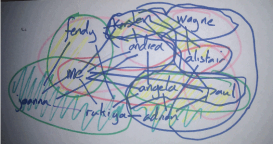
image credit: http://www.wombling.com/
Lets take a look at why this happens. Suppose there is a new project being undertaken at ABC company. The powers that be will assign a project manager and a project team will form. The project manager will then cherry pick people from IT, Marketing, Sales, Finance and any other relevant product, functional or regional areas of the business to work on the project.
For the project team, each person will have his or her tasks and will be accountable to the project manager for the said tasks and deliverables. But as a member of the team person will also still maintain a reporting relationship to the direct manager (and deliverables associated with the persons ‘primary’ position) who will be responsible for oversight, feedback, salary and general career progression.
Once the said project is over, the team will be dissembled and placed back into their places and respective departments. Another project starts and the process repeats itself.
Now suppose we made a dotted line reporting every time this happens and removed it every time the project ended. Not pretty right? It makes it really hard to track original positions of the the team members and track and delete the dotted line reports. It’s would essentially turn the Org Chart into a spider web of dotted line reports running across it (this is especially true for large organizations with numerous projects, running both serially from phase to phase and in parallel with each other).
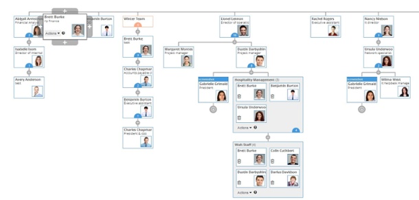
Here at Organimi we currently have a couple of ways to represent “dotted line” reporting structures. The way we look at is that essentially the person is being shared or duplicated in two roles: first, as part of the department (and routine tasks & deliverable as part of the position) and second as part of the project team, for the time period during which the project is happening. Once the project is over, the person resumes his or her primary position (or moves back to the original position).
Since Organimi allows for duplication of roles or positions (each role or position in the organization is treated as an “object” independently of any person actually filling that role or position) we always suggest to our customers to duplicate the role they want to represent as a dotted line report into the relevant project/team.
Give the team a different color (to signify that this is a temporary construct in the Organizational Chart made for dotted line reporting purposes) and also retain the person in the original role they occupy.
This avoids the cobwebs of dotted line reporting that you would see in Organizational Charts and at the same time gives you the flexibility and convenience to click ‘delete’ when the project comes to and end without moving people back to their original positions.
Here’s what one of our customers had to say about this approach:
“Good workaround. I’ll use that.” – CEO @ Wego
We hope you agree.
Another option, we can discuss in another blog, is our “Groups” feature, which lets you incorporate a group (such as a project team, or even the office baseball or holiday party planning committee) into a “Group”.
Give Organimi a try and let us know what you think.